
Vanguard user account: Data visualization dashboard
Background
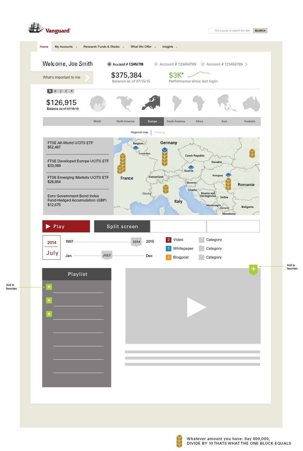
While at Vanguard I designed a conceptual user dashboard to drive investor diversification. By asking 'How might we encourage personal investors to diversify and/or increase their asset allocation outside of their existing investment portfolio?' The idea to create a geographically driven data visualization of the user's investment accounts led me to rapid prototype a mid fidelity UI mockup. The design envisioned new features and functionality to test drive asset diversification.
Account Overview
When a user logs into their dashboard they would see a high level view of one to many investment accounts, and their performance over a specific time period. This format would be dynamic and previously determined by the user through a wizard UI and accessed through the link 'Whats important to me'.
Regional Map
A breakdown of individual accounts would allow for further drill down by region/continent and additionally by country.
The map data visualization features would enable a user to hover over any country that displays brown or blue blocks (Representative of a relative investment amount) and see contextual drill down information on the performance of a particular asset class or fund.

Performance Ranking
Similarly, a user could change the geographic map view to a heat map of country-by-country performance through a static 'Ranking' Filter. This feature would also enable users to better understand where their funds are being directed and specifically to what industry.
Timeline Scrubber
Users would also have a powerful timeline feature to see their investments grow and shrink in a region over time. As a user scrubbed to a particular moment in time, they would see the regional map or timeline reflect the growth or decline of these funds reflected above.
Supporting Though Leadership
Based on the timeline, and the underlying funds, thought leadership in the forms of videos, white-papers, blogposts, etc, would appear to provide context into what was happening in the market at that time to help. Present day, this would be a good use case for Ai inclusion to both explain what drove a change as well as help the user determine if they want to make a change: further investment in a fund or category, divestment, etc.
Final Outcome
While the concept was promising, the technology to implement and the benefit to users was too costly to implement. That said, we generated a great deal of interest in redesigning a future state version of the site which allowed for a 'Next Gen' Design rollout of Vanguard sites.