Background:
GOLO.com was founded in 2009 as a direct to consumer health and wellness company with a nutrient and dietary supplement product named 'Release'. By the early 2020's the company's product line has expanded to additional supplements and meal kits (GOLO Foods). The website had been built on a Shopify themed traditional content management system (CMS) and they were considered transitioning to a headless CMS in 2025/2026 future state rebrand.

Discovery / Research Phase:
As part of discovery, I'll review a website in part or exhaustively to determine the current state of the UX/UI. Prior to a competitive analysis, a heuristics review helps me to document my observations and questions around an existing user interface including the navigation, content structure, calls to action, functionality, usability, etc. It also helps me to understand the underlying purpose of the user experience; What information the company wants the user to understand; Actions they want the user to take; Where they might be experiencing friction or delight, etc. For this review, I provided a limited evaluation.
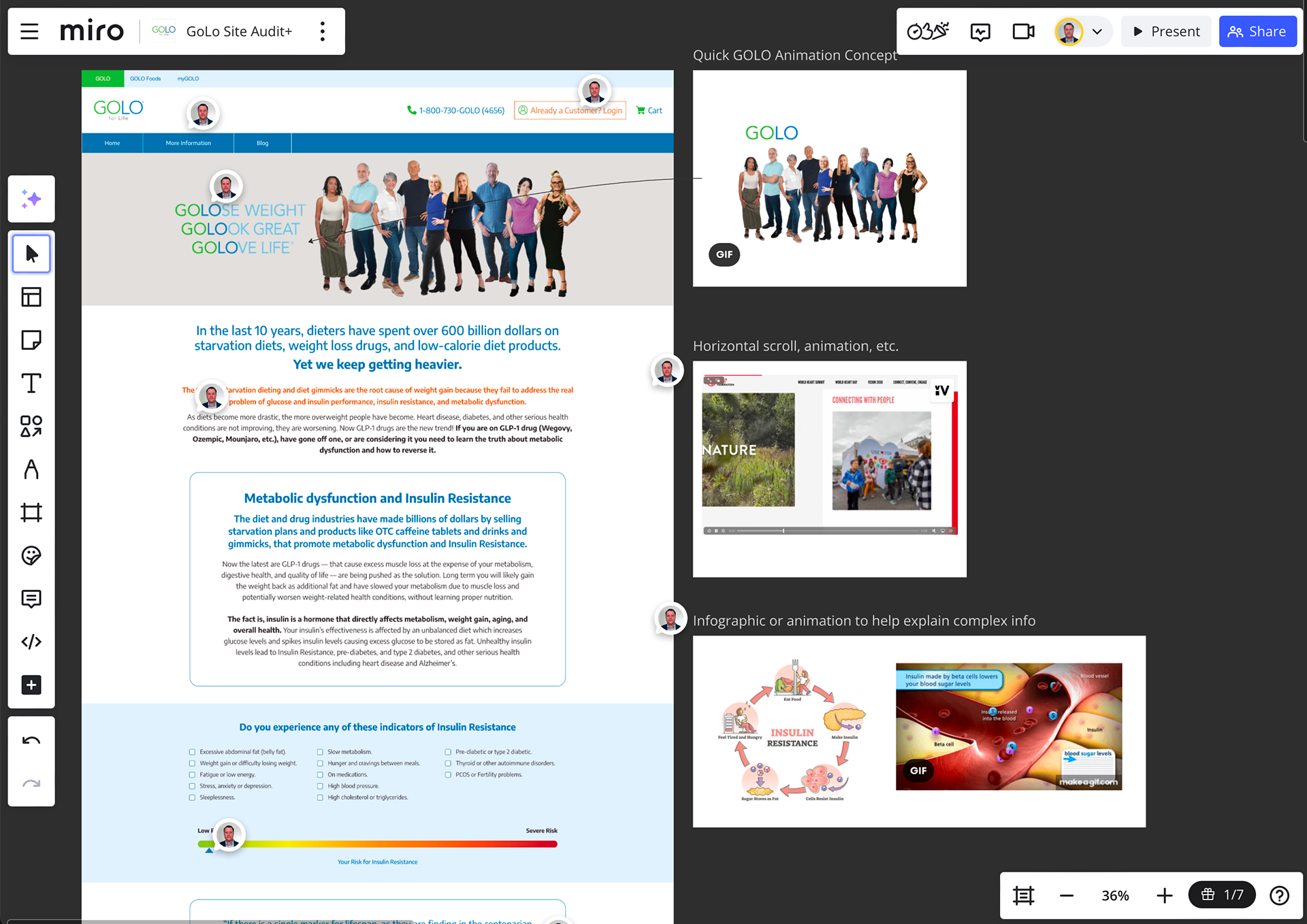
Click the above image to explore the Miro whiteboard shown here.
Theme 1: Simplify the story
Throughout the review the content structure was repetitive and lengthy, I documented a consistent opportunity to simplify the storytelling. With the body content of the main page divided into 20+ sections, it felt structured like an infomercial or product white paper. The first several sections outlined common weight loss problems, pulled in social proof from medical professionals, and highlighted testimonials from satisfied customers before introducing the product. If a user wanted to proceed with a purchase, they would have to entire scroll the length of the extensive page before a call-to-action 'Shop GOLO' button. A similar format resulted on the purchase page adding unnecessary friction.
Theme 2: Add funnel supportive elements and features
Throughout the site, I made suggestions to improve visuals and copy. On the main page for example, the static hero image amalgamates the logo with a marketing campaign to 'Lose Weight; Look Great; Love Life'. This might be better executed by adding a small animation of the logo separating to form each statement. Similarly, in a questionnaire section, I suggest that a smoother animated micro-interaction might support deeper engagement. Likewise, the use of a sticky button or additional 'Shop GOLO' buttons might help users to purchase with less friction. That introducing side scroll may help to breakup a long, drawn-out story. That accordions could help to hide extensive clinical trial copy not relevant to all users. And, including infographics and medical animations might help with user comprehension and messaging. These observations would be A/B tested for results.
A quick proof of concept for the proposed GOLO hero animation.
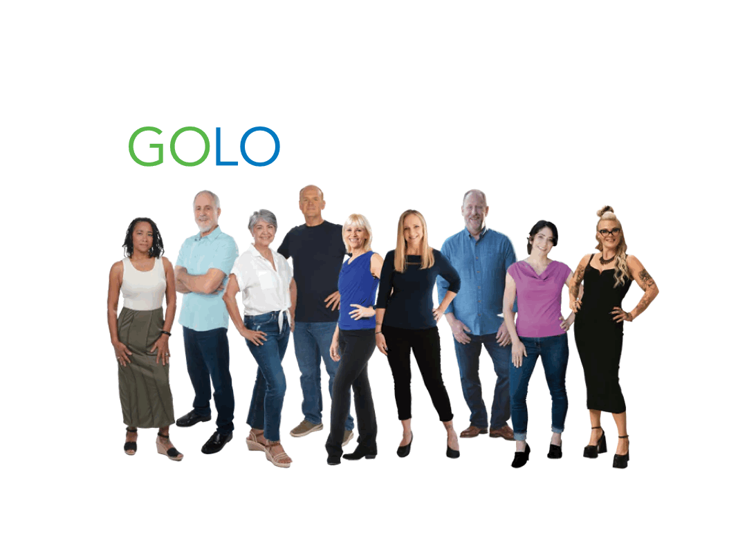
On the GOLO Foods page I also made suggestions to refocus on storytelling through video, micro animations and interactions, etc. I pulled examples from other food product companies like RxBar and noted:
'Consider the way RXBAR lists out its ingredients to relay a core components of the brand. It embraces attributes like 'No B.S.' Simple ingredients; From Scratch; No Additives; Clean eating; Simple'
I suggested a core focus on of the meal kit product messaging should center on the simple superior healthy ingredients to differentiate from other meal kit providers like Blue Apron, Hello Fresh, or Home Chef.'
I noted that appeal, intrigue, delight, and usability could be significantly improved by GOLO combining rich storytelling with enhanced features and functionality.
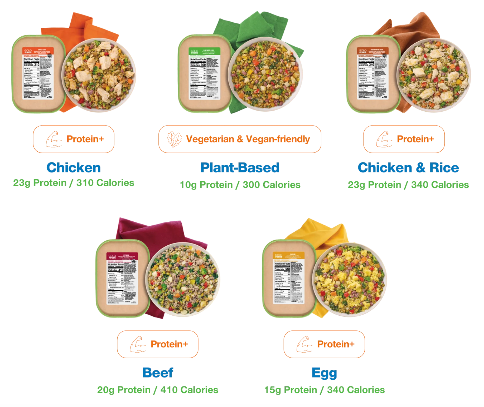
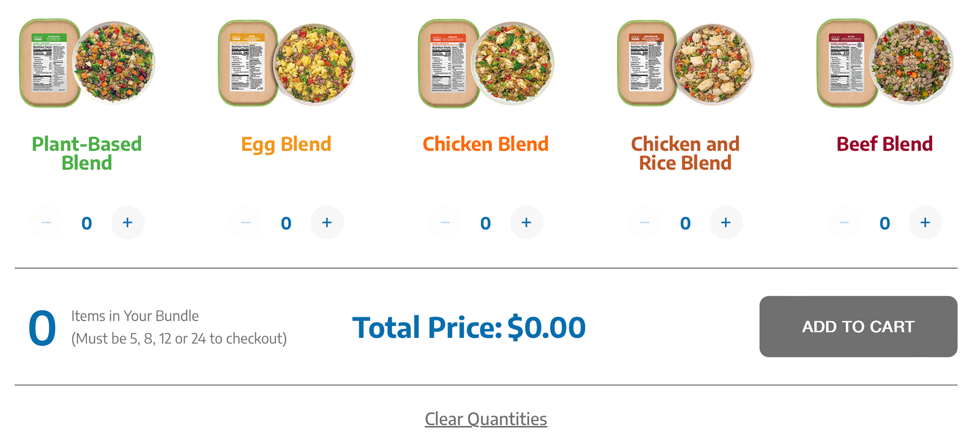
For example, it's unclear to users how to order these products until they finish scrolling to the bottom of the page. There they'll find a single call to action 'Shop GOLO Foods' button. But the 1st and 2nd static images of the meal kits do not enable the user to order 'now'. In reality, users cannot select and order various meals until scrolling to the bottom of the next page (image 2).
Instead of adding unnecessary friction...
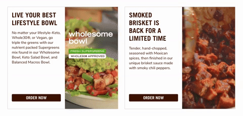
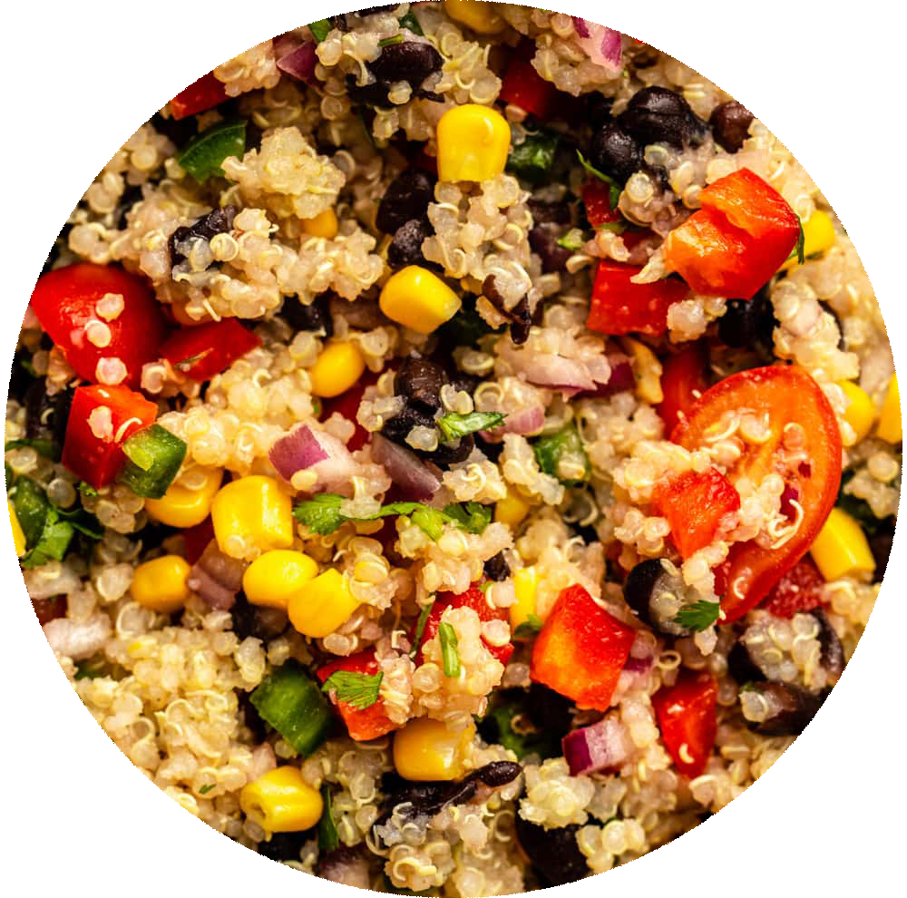
...what if we provided the user with high quality video clips of these meals being prepared and plated to show their quality and appeal? I included an example from Chipotle in the heuristic that promotes both desire and enables action (image 3). Additionally, supporting micro actions like zoom for the images and ingredients, could encourage transparency and inspire trust (image 4).
Theme 3: Implement a robust design system
Lastly, I documented a lack of consistent brand guidelines for several types of content. When it came to the typography, text size, and color, it appeared that they were primarily used to align with the section style and background, rather than following the rules of a typographic system. Similarly, the style guidelines for photos, use of iconography, and other graphic elements seemed to be inconsistent. I suggested implementing a robust design system that considers both current and future state versions of the site.
Related Heuristics:
In the past I've delivered these reviews in a presentation or report format, but now I tend to use Miro as a collaborative tool to better solicit feedback and participation from stakeholders and project team.

